YouTube has spent more than a year quietly rebuilding how its platform looks and feels, in what design lead Jonathan Terleski describes as the most significant design overhaul in the company’s history.
A Platform That Outgrew Its Own Design
YouTube has grown from a small library of low-resolution clips in 2005 to more than 20 billion uploaded videos today, adding features like Premium, Shorts, and Shopping along the way. Its design, however, didn’t keep pace with that growth. For years, YouTube’s product decisions were driven mainly by performance metrics rather than any unified design approach, which left the platform with cluttered screens, inconsistent icons, and confusing pop-ups.
Fixing The Culture Before Fixing The Screens
The first change Terleski made was organisational. Previously, different YouTube teams, such as those running YouTube Music or the living room app, each owned their own design decisions independently. That siloed structure meant illustration styles varied across the platform and old buttons or repeated information piled up over time without anyone responsible for cleaning it up.
Terleski’s fix was to build a new cross-functional design systems team made up of engineers, product managers, and designers, tasked with creating one unified design language across all of YouTube. That team operates around five guiding principles: keeping video content the visual priority, judging features by actual usage data rather than assumption, choosing simpler user paths over redundant ones, keeping new features consistent with the rest of the platform, and building design into products from the very start of engineering work rather than bolting it on later.
What The Redesign Actually Looks Like
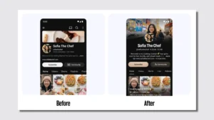
Terleski compares the new design approach to a kit of Lego pieces, first deciding which visual elements are worth reusing, then documenting exactly how those pieces should combine. New elements introduced under this system include a custom font called Marquee, subtle background glow effects, and dynamic glass-style buttons.
The clearest example of the cleanup is YouTube’s watch page. The old version reportedly carried two separate play buttons, a non-functional back button, overlapping captions and chapter titles, the channel name repeated ten times, two separate prompts for YouTube’s search feature, an action bar crowded with 13 different options, and two references to the same creator’s store. The redesigned page strips that down so the video, its title, and the comments become the three things that stand out. YouTube also swapped the page’s white background for a darker one, which internal testing suggested keeps viewers more focused on the video itself.
The Business Case Behind The Cleanup
The changes aren’t purely aesthetic. Terleski says the streamlined watch page has already boosted engagement and watch time, though YouTube hasn’t released specific figures. That improvement reportedly created enough of a revenue lift that the company used it to justify removing billions of “leave-behind ads,” the small ad bars that used to linger at the bottom of a video after a full-screen ad finished playing.
The broader argument YouTube is making is that features designed to grab attention, like extra buttons and lingering ad bars, can actually work against the platform rather than for it. Cutting them out, in this framing, tends to correlate with stronger engagement and revenue rather than weaker ones.
What Comes Next
Terleski describes the redesign so far as only the early stage of a much longer process. Future updates are expected to make the platform feel more dynamic and animated, rolled out gradually so viewers and creators have time to adjust rather than facing one large overhaul at once.
The bet YouTube is making is straightforward: that a platform people choose to use because they genuinely like using it will outcompete one that simply holds their attention through friction and clutter, and that a cleaner design is ultimately also a better business strategy.